Redesign Compose Experience for Yahoo Mail
| Date 2016 | Role Designer & Prototyper |
Background
There are many interactive elements inside email compose, especially on legendary email applications like Yahoo Mail. Throughout the years, Yahoo Mail has added many features to make writing mail more and more powerful and fun: you can set templates to make your emails chic and pretty; you can add gifs to make them fun; and you can resize images to make your content more appealing. As our team works on redesigning Yahoo Mail, we examine our products again and discover many things we can improve on in terms of both interaction and function.
Below, I am going to go through two major parts I redesigned inside the mail compose: stationery and attachments.
Stationery
Why We Start this
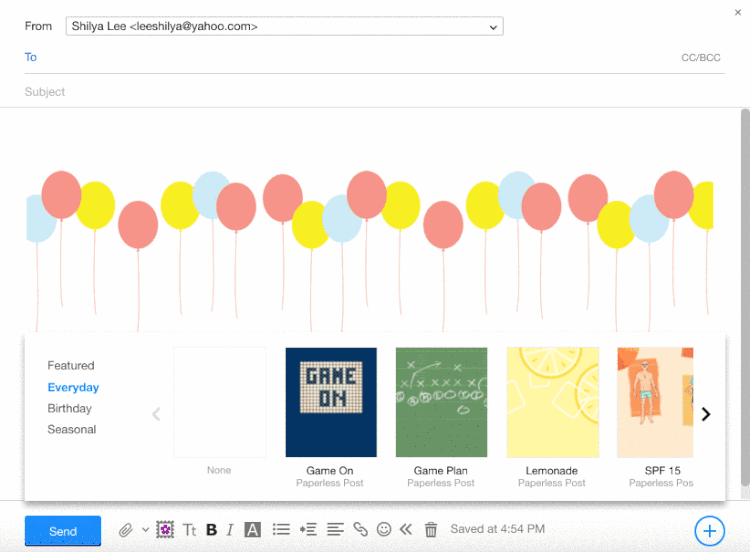
Original Stationery design
See the image above. There are two major issues we want to solve here:
1. Default template: To make it easy to access this often-used template, we have a blank square for users to set default template, so the template will show in the body whenever they start a new compose. This is an improvement on the current UI, in which it’s very unclear what this white box is for, and the default text doesn’t show before the user sets one.
2. Navigation: The arrows are at the two sides of carousel, and category is at left end. Whenever the user chooses a category, to navigate to the next page the user needs to move the mouse cursor all the way to right end of the widget.
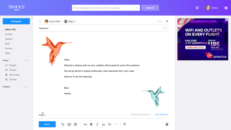
New design
Below is the mockup for the new design and these are the things we improved:
1. The default template is singled out from navigation area with the permanent title “Default” to indicate what it is for.
2. We use a tab at the bottom for categories, and the user can use the mouse to scroll quickly through thumbnails, instead of clicking buttons on two far ends. Also, the tab at the bottom of the widget is because it’s close to the stationery button on the toolbar. And since the title and where it is from generally doesn’t affect the user’s choice, I decided to hide it inside the thumbnail so the thumbnail area can be cleaner.


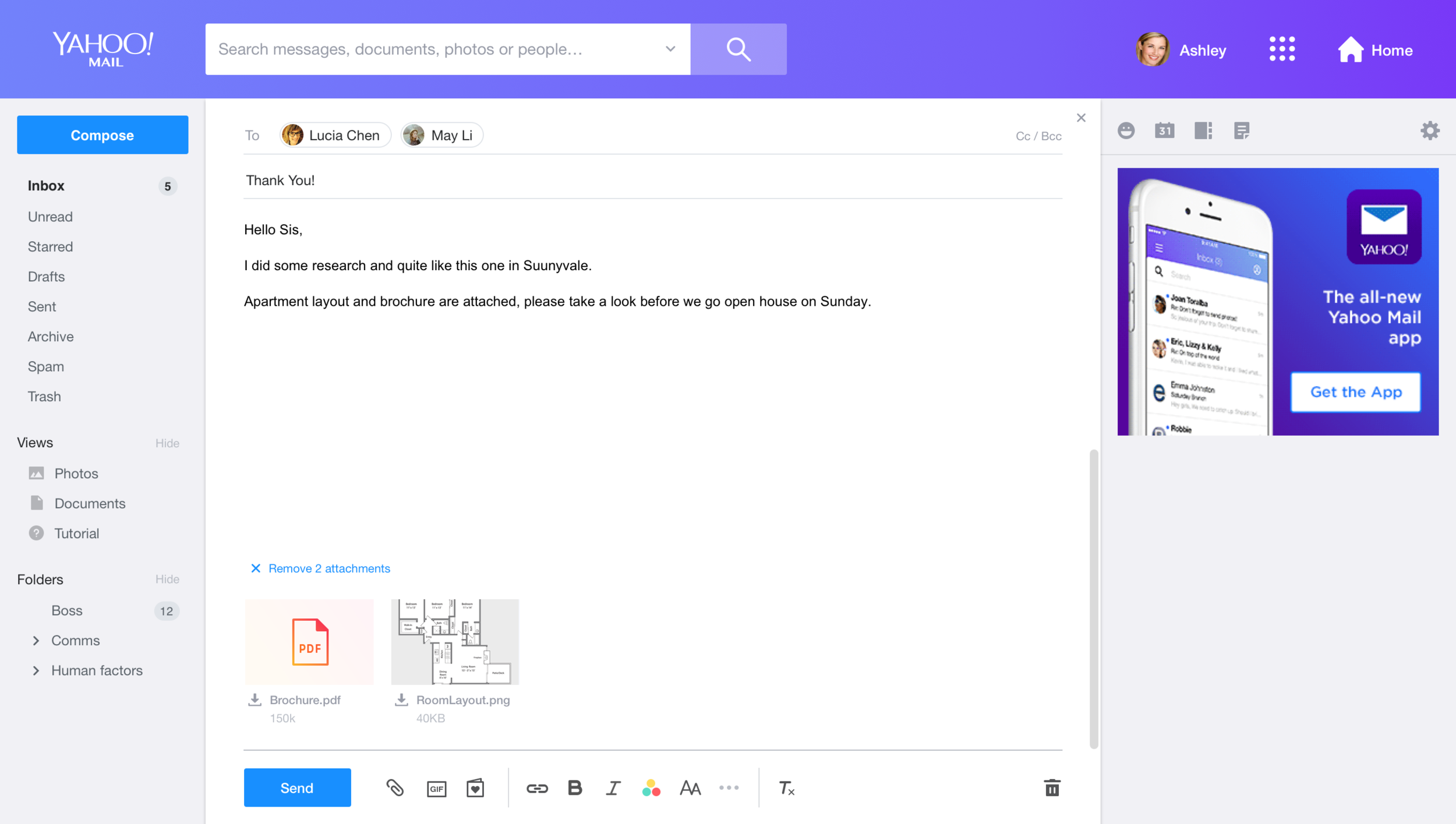
Attachments
Understand Use Cases
There are two user cases we will see attachments in: “compose” and “message read.”We think the UI should be reused and the interaction pattern should be similar, and based on the attachment type, file or image, the functions required are different (see the chart on the right side).
When we decide on the functions we need to provide, there are two major debates on the team:
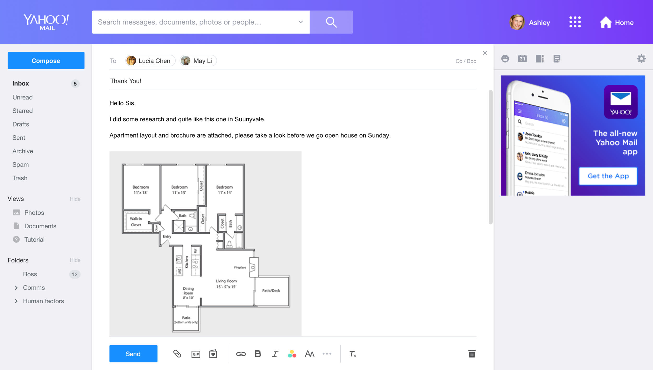
1. Do we need to provide a preview for the attachment in compose?
Users upload the attachment from their computer to compose. Ideally, they should know what’s inside the file.
However, we found that users take email as their “storage.” Often, they just upload files they want to keep to “draft.” Also, users might upload files from one device and later go to other devices and continue writing. In particular, the behavior switch between phone and computer is very common now. Thus, we decided to have the preview for attachment in compose as well.
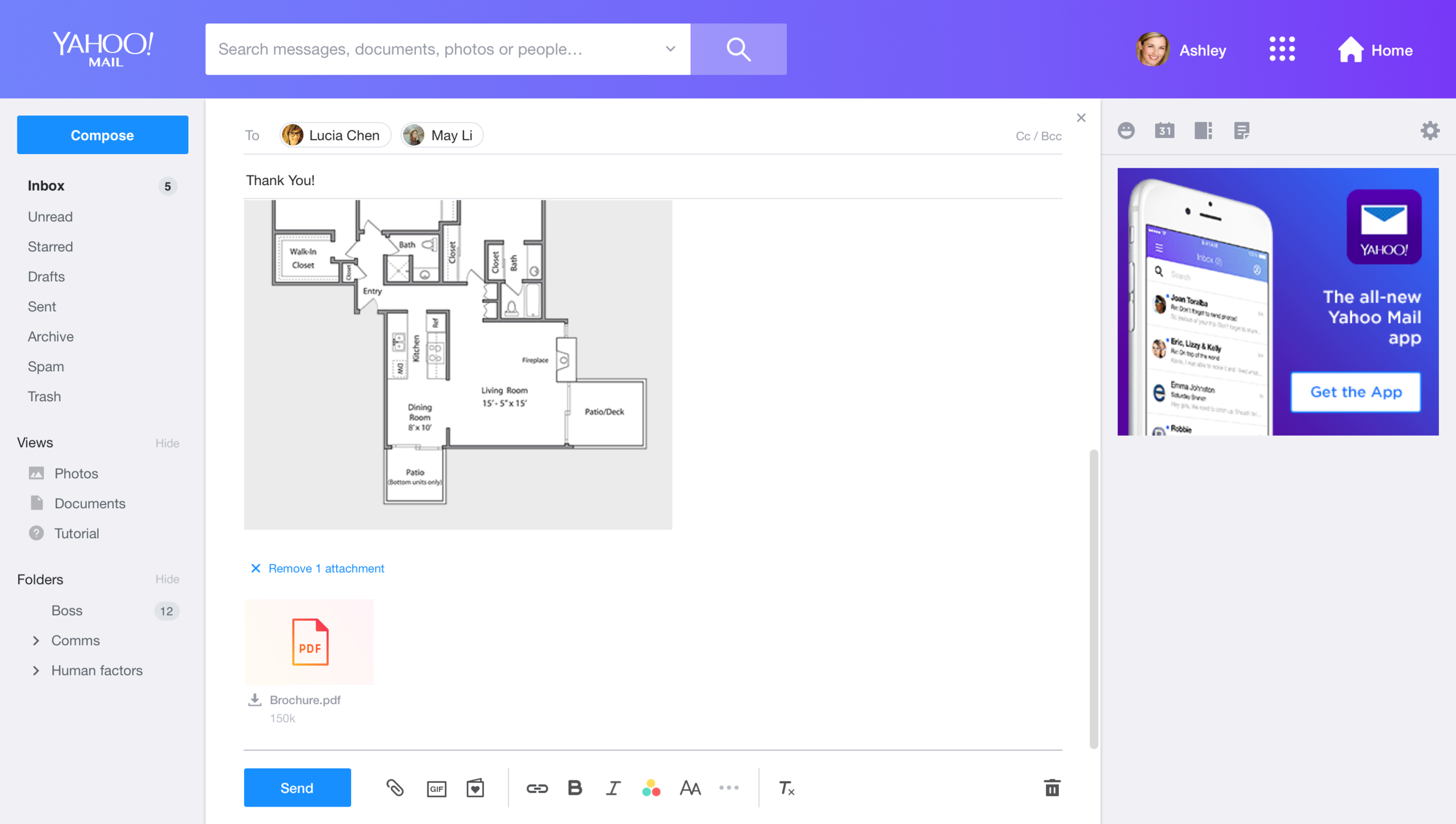
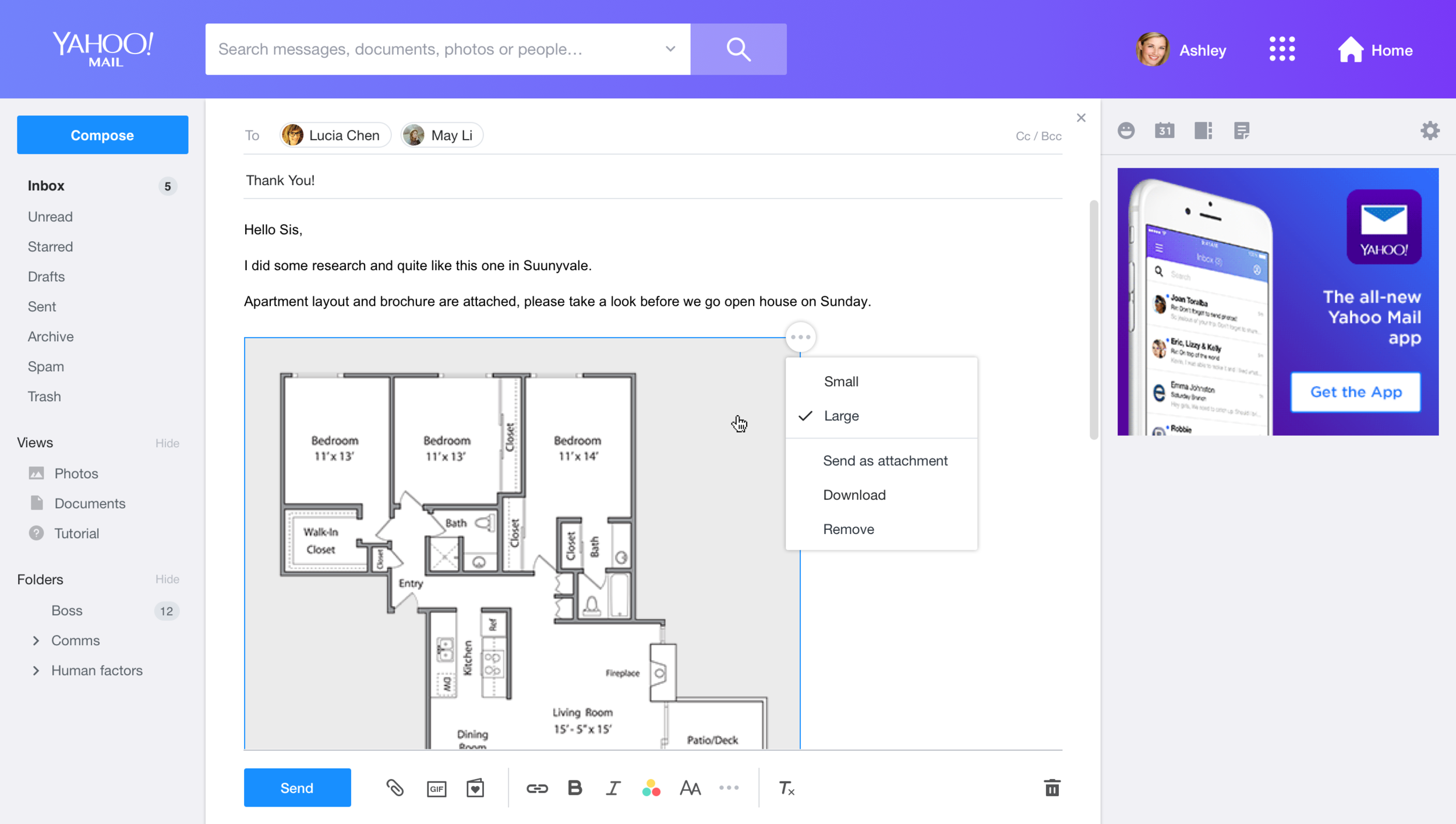
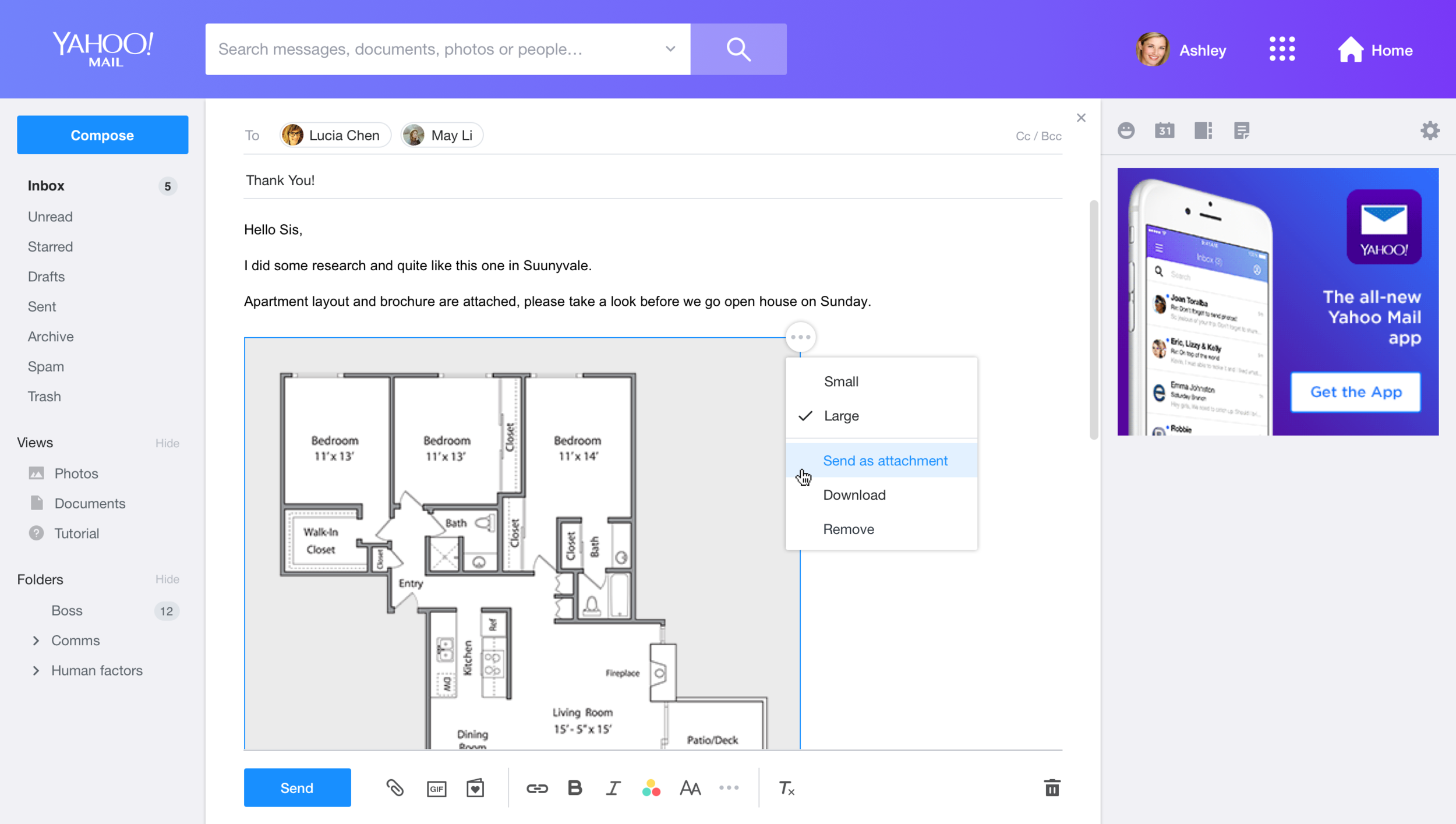
2. Do we need to provide a function for moving an image between the inline body and the attachment tray?
In current Yahoo Mail, if you drag an image to compose it would be automatically added into the compose body. However, when users want to send out multiple images through mail, the flexibility of moving between body and attachment tray actually helps them organize the message better.
Prototype & User Testing
We went through a few rounds of mockups to ensure that the style in both message read and compose can be synced.
Because an attachment thumbnail has many tiny interactions, I built the prototype with JavaScript and Html quickly and invited users to test it to ensure the interaction is smooth and that users can understand the UI, Through user study, we received a lot of good feedback and ideas, e.g., we found users instinctively try to drag images from attachments to the message body, and decided to add this feature into the product.

Outcome